Connor
Artist Statement: A Week's Worth of Travel
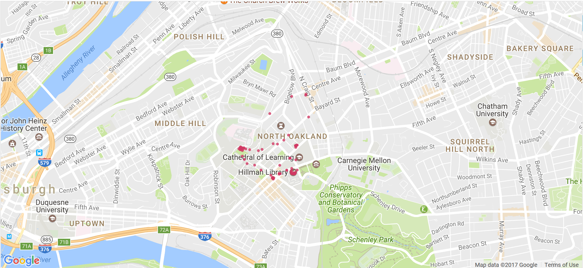
Bokeh plot with only my points plotted
For our group Synthesis, we decided to visualize our movements throughout Pittsburgh and beyond over a week. We did this by using are phones to record GPS locations of where we were throughout the week from 4/2/2017 to 4/8/2017. We did this through a couple of different apps. A few of the group members used an IOS app called Follow Me, while I and Maya used the Android app GPSLogger. This gave us GPX files which are XML files manipulated for geospatial data. With these, we could convert this data to a combined csv of all our coordinates. Then, using Python and Bokeh, we plotted our data as a set of points over google maps, with toggles to observe different individual’s points. We also displayed a basic google maps visualization on all the personal pages as well, which display our locations as a line. The script is one of the primary things I worked on. Jahari built the backbone of the original script, and I fixed the tooltips and buttons as well as rewrote the plot to plot together. Originally the map was not contained within the bokeh border, and would bleed out onto the rest of the page. I also worked on the primary website design with Maya. I set the basic design with the homepage and the blog like artist statement navigation.
So what can we learn from my own plot? First, my google maps plot has a trip to New Jersey while the bokeh plot does not. This was done to keep the map zoomed in enough to be useful. Therefore, the analysis may refer to things that might not appear in a plot. So, besides the outlier trip to New Jersey, from the Google Maps diagram it seems to have two defined loops that almost makes concentric circles. The outside loop that goes all the way around the city is me going to and from practice in the morning. Then after that, I have a second smaller circle which is me going about my week with class and other things. With the bokeh plot, we can examine this smaller circle in more detail. It appears that I have three main bases of operation in The Cathedral of Learning, my dorm, and Hillman library. Must have been a slow week. What we see from both plots in general is that I seem to have a very defined loop to my travels, which the other group members do not seem to display. Accuracy wise the application did well, with some occasional inaccuracies with location. This is best seen in the Google maps plot on my page, where it has me going to Long Island, a trip I never took. This inaccuracy seems to lead us to some insight on how the location app works. It would appear that it pings Wi-Fi access points to get locations be default and then when there are not any access points nearby it pings the nearest cell tower, which may accidently ping the cell tower as a location. More analysis would be necessary to confirm this however.
This visualization leads to some interesting general conclusions as well. The first is that GPSLogger seems to know my location better than me. At first, I chalked up some things to inaccuracies in the app, but eventually most of the “inaccuracies” could be chalked up to me forgetting that I went somewhere (except for the long island trip). So, besides the human brain being worse at recall than a computer, there are also other bigger questions and ideas that come from this sort of experiment. For me, the original idea of using location data was brought into my mind when looking at modern trends in privacy legislation, such as the House of Representatives resolution that would allow ISPs to sell all user traffic data. Some of this very well could be location data, which could have substantial implications for our own privacy and data security. Knowing someone’s location is one thing, but with the addition of other data that is publicly available like tweets or Facebook posts or other things, one can create a comprehensive picture of a person’s life. It can reveal your visits to churches, clinics, bars, or lovers; it can show which protests you’ve participates in or which political organizations or support groups you’re a part of.
There are a couple things I would have done differently had I had another shot at this. I would have liked to have learned how to plot GPX files natively instead of needed to convert the data to CSV, as that resulted in a lot of curating and cleaning up data. I would also have liked to make the script significantly better. Bokeh was a little finicky to begin with and we didn’t come up with the best solution for having multiple data series by using another JavaScript module to make the toggles. We also did not have enough time to really make use of our data to draw actual data driven conclusions. I would have liked to analyze percentages of time spent in places and percentages of when people did there most travelling. In addition to this, a network visualizing shared locations would also be an interesting visualization of this data.